Sunday, November 28, 2010

The final weeks...

­Interiors:

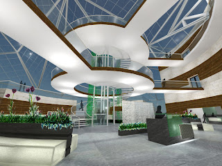
This week being Thanksgiving break, we did not accomplish as much as we had in the past weeks but continued to work over the break to meet our upcoming deadline. From last Sunday we worked extremely hard to get all of our interior renderings and section perspectives complete. We accomplished this and we were even able to Photoshop each rendering to create more realistic views. We also finished rendering each floor plan and began aiding the architects in rendering the exterior of the building.

Over the break, we not only ate a substantial amount of turkey but we also researched each material used within the interiors and gathered the specification information that pertained to healthcare facilities and sustainable design.

For the upcoming week we plan and must complete all the exterior renderings, put together our presentation, finish gathering all of our information that belongs in our project booklet, make the materials board, and drive to College Station all by 5:00 PM Thursday and somehow get a good night sleep before the drive.

Architects -

This week we finished our sketchup model by adding shading systems to the facades vulnerable to sunlight, and making final decisions on window placements, and materials.  We also finished designing our two remaining happy spaces, the living machine water treatment area, and the family garden space.  Our site for the final model has been cut out and put together and the rest of the model is a work in progress, but thanks to our awesome interior designers, we were able to laser cut the pieces of our roof out and build a template, and now its just a matter of putting the final roof together.  Our plan for this last week is to finish up the renderings, really crack down on the model, and work on the final drawings for our exterior wall sections, ventilation diagrams, and structural diagrams.  Sleep is over rated anyway.....


Sunday, November 21, 2010

Week 7: RENDERING.....

Architecture:
This week we worked on further developing the exterior of the building by adding mullions to the atrium, detailing the materials on the facades and deciding on window placements around the remaining facades of the building, as well as the community shopping center we also chose to redevelop.  We also managed to finish building our site model and finalize our parking and remaining parts of the site. 
Interiors:
This week we worked really hard to get as many of our renderings done as possible.  We wanted to make sure that these were ready to go so that we would allow plenty of time for the very long rendering times.  Our massive glass atriums are a great design but with all the reflections and refractions of the daylight and interior light they make for extensive render times, however in shifts we managed to move that mouse every twenty minutes for the eight hours that they were rendering.  Aside from the rendered we have started to contemplate how we want to present our project at both the A&M and Tulsa locations.  This part of our project will be executed in the few days after we return from Thanksgiving break.


Goals:
This week the architects plan on working towards final renderings, as well as working on the final model. For the interiors, we plan to complete our last section perspective along with starting and completing at least 30% of our construction documents. We also are going to have all of our perspectives and other renderings complete in Photoshop by Tuesday in order to send them home with us to work on the presentation layouts over the Thanksgiving break.

Sunday, November 14, 2010

Week 6: Development and final details

Interiors:
Last week we set goals for the interior to finish at least two renderings and begin to render the furniture floor plans. Unfortunately we overestimated the amount of work we could do in a week. The two renderings we were referring too are extremely detailed and enormous spaces. Because of this we were only able to finish 90% of the renderings. The chemo station perspective needs to have the garden space hand rendered along with the café area. The café also needs the roof structure to be put in place and then final render.
Along with the renderings of the perspectives we also finished the elevator “skin” model and began to render the café furniture floor plan. The café floor plan in about 80% complete and will be done by the end of Tuesday. We also worked on the modeling of the patient exam rooms. We specified the systems furniture that includes two bottom cabinets with a sink and two upper cabinets for storage. This rendering should be done by no later than Wednesday!
Architecture: This week we completed our final site development stages and finished the development of our under ground parking.  We also finally figured out our structural system that will support our glass atrium roof.  We found a system that will gives us the support we need without significant impact to the interiors.

Skin for the elevator:

Skin for the elevator:

Unfinsihed perspection of chemo stations:

Unfinished perspective of cafe:
Goals: ID-  goals for this coming week are too finish all renderings in 3D Max and have them ready for Photoshop.  Also we are going to complete our reflected ceiling plan for the developed 8,000 square feet as well as teaming up with the Architects to start working on our section perspective.  ARCH- goals for this coming week are to start and make significant progress on the site and building model.  Also to complete the exterior walling section drawings and models.  GROUP- to stay focus during this next week to get most of our project completed so that when we get back from Thanksgiving break we can focus on our presentation.


Sunday, November 7, 2010

Week 5 Development!

Architecture:
This week we began to work with the site, choose materials, and detail facades and atrium spaces.  After fully analyzing the site we realized that the drop in elevation was much steeper than we had originally planned for.   Seeing as though we wanted our building to feel as though it were part of the site and not just planted on some flattened surface, we began sketching to think of ways to use the change in topography to our advantage.  Our solution was to use the lower elevated part of the site as an entrance to an underground parking garage under one of the wings of our building.  This way we could free up the parking spaces that were close to the “happy spaces” around our building and use it for green space. 
For materials we finalized the decision to use locally produced materials such as Tulsa limestone, and Tulsa lumber for the large amount of forestation in the area.  By using these materials we are able to create a warm and inviting feel, make the building feel more local, and hopefully help stimulate the Tulsa economy by buying  materials that are being produced in that region.
We also began to make decisions on types of spaces we wanted for our three atriums.  Instead of having three spaces that all felt the same, we wanted them to be different to create interest to the visitors of the hospital to encourage exploration.  That being said we came up with three different themes for the “happy spaces” within.  The first is a Japanese garden, meant to be therapeutic and calming for those going through chemotherapy.  The second is a family garden with more local vegetation, picnic tables, and more family activities for people who are visiting /waiting at the hospital to go.  The last one we have decided to use as a water treatment area in which we would use a “living machine” system to help clean the purify the water within the building. 

Interiors:
The beginning of the week we began to buckle down on the modeling of the interiors. We fully developed the café area and determined the egress plans and circulation patterns for all three floors. The café is a key element in our design of the “Epic Center” that sits above the porte-cochere and entrance. It is designed to be the place to get away from the chaos and grab a coffee and bite to eat while getting a great view of the surrounding neighborhoods and a glimpse of downtown Tulsa.
After many hours and days of modeling of the specialty clinic, chemotherapy, dialysis, café, and entry, we were finally able to bring our design into the rendering phase. Before the rendering began, we had to carefully select the views in which we would show the client. These perspectives would allow the client to fully grasp the connections between each space and the overall appearance of the building’s interiors. We also had to narrow down our material selection in order to render the perspectives correctly! This process sounds simple however it is a difficult development. When choosing the materials to go within each space, we had to take into consideration the type of material, the environmental impact, the durability, and the strict requirements that healthcare facilities demand.
Materials Chosen:


Goals for the upcoming week:
Our goals for this next week are to really start focusing on the details of the building, finalize the roof structure, and if all goes well start working on our final model. For the interiors, we plan to have at least 2 renderings done and begin to render our floor plan. Although the interiors portion does not sound extensive, the rendering portion of the project is the most time consuming.